Items sent for honest review. Opinions are my own.
Some affiliate links.*
You all know how much I L-O-V-E water decals. They are the epitome of easy, arthritis-friendly (or, chronic pain-friendly) nail art. So, I am always on the look out for new to me designs and willing to try most any of them.
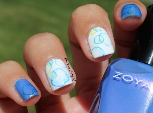
I eyed these peacock decals from Born Pretty Store for a while and finally decided to try them. They were cute and pretty but honestly, I was a little let down. First, the product only comes with 10 designs which is a little unusual…That’s not a lot to work with. For example, if I wanted to use a decal on each nail that would only leave me with enough for one manicure, right?
Though, to be fair, these are similar to full nail designs which never come with a lot.
My other biggest issue was the gradient style of the background ended in white which means I could only use it over a white base. Not a big deal but makes the decal way less versatile.
Otherwise, they performed well, slipped from the backing properly and didn’t bunch on the nail.
Check them out below but before you do, don’t forget to…
Join my Spoonie family!
YouTube | Instagram | Facebook | Twitter

 Bases: Zoya Rocky (blue), Essie blanc (white)
- Dry brush detailing
Water Decals: Born Pretty Store peacock feathers* ($0.99/piece)
Want to know how I did this? Check out my water decal nail art tutorial below:
Hi, my name is Monica and I have RA.


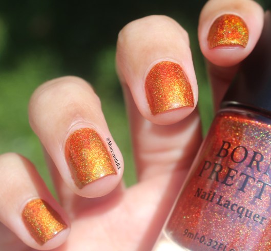 Notice anything unusual??
 Not yet?
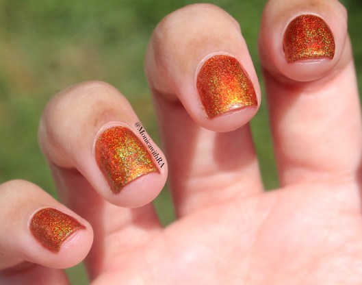
 Wait for it…
 What is happening?? First, top coat dulls the holo and makes it look more like orange shimmer. Second, it shows a massive uneven finish in color! Why are parts of it super dark? I did even coats on each nail. It is an odd reaction that is extremely noticeable in any light.
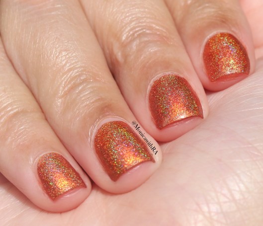 Clearly there is a difference when it comes to top coat application and unfortunately, it’s an issue that plagues most holographic polishes. The addition of top coat always diminish the rainbows! The orange is not as bright so I guess I have to decide. Do I want brighter orange or brighter holo?